Ergonomics of Kitchen: How we do it at Bristol Springs
One of the worst things that can happen to your home is a poorly designed kitchen. If you’re someone who wants to learn about the ergonomics of a kitchen, you should know that it needs your attention on health and accessibility.
An ergonomic kitchen design is made in a way that it complements us healthily and practically. Being forced to constantly bend, reach, and strain can cause chronic back pain and even permanent damages in some cases. In addition to that, the frustration one has to face during tasks like cooking food and cleaning up. No matter how beautiful your kitchen may look, you won’t be satisfied if it hurts your back.
Considering all these factors and the comfort of our clients, Bristol Springs always tries to create the best of the kitchens in our custom homes. Let’s learn about some basic ergonomics of a kitchen that we take care of while designing our homes; you can also use these if you’re in the middle of building a new kitchen or a kitchen renovation project.
Kitchen zoning a modern approach
Making work zones while kitchen planning is an amazing thing that you can do to make your life easy. The zone theory divides your kitchen layout by function. It means that each of the functional zones of your kitchen are divided and arranged in a way that it makes the process of cooking and cleaning easier. Here’s how at Bristol Springs, we usually do this in the kitchens of our custom homes.
- Food storage (pantry, refrigerator)
- Food prep (cooktop, microwave, oven, small appliances, spices, mixing bowls, cutting boards, etc.)
- Pots and pans
- Cleaning and waste (sink, dishwasher, cleaning supplies, compost bins, and garbage)
- Plates and cutlery (cutlery, glasses, bowls, plates, electric tea kettle, and coffee maker)
In all of our custom-made kitchens, you’ll see everything so well arranged that it almost looks unreal. Considering the needs of a modern family, who likes to live away from city life, we always try to create walk-in pantries for enough food storage.
The right distance between benches and fixtures
It is essential to have enough room between workspaces like benches in an ergonomic kitchen – if it’s too little, you will feel cramped, and you will constantly be stretching and reaching for hot, heavy pans if the situation is otherwise. A distance of 41 inches is often regarded as the minimum, while 47 inches is considered ideal for most. More than 55 inches between fixtures and benches can lead to ergonomic inefficiency and waste of space.
Watch your head!
If you’ve ever leaned forward on the stove to smell the delicious simmering sauce and banged your head on the hood, you’ll know the significance of the positioning of wall-mounted appliances. The minimum clearance between range and stove should be 26 inches for a gas stove or 24 inches for an electric stovetop in a kitchen layout. However, most appliance manufacturers recommend a distance between 28 inches and 30 inches, which can be increased. In a Bristol Springs Custom kitchen, we take these figures very seriously to create spaces that offer our clients the utmost comfort level while preparing food.
Illuminating the work zones
As they say that the devil is in the details! In an ergonomic kitchen design, lighting and illumination can never be neglected; it is essential to provide proper lighting to all the work zones.
- Ambient lighting: The overall general lighting should be sufficient and placed centrally.
- Task lighting: Then move towards your cooktop and install task lighting above it to provide ample light while cooking.
- Accent Lighting: Use strip-lights or LED down-lights beneath wall-mounted overhead cabinets to illuminate the countertop where basic food preparation is done.
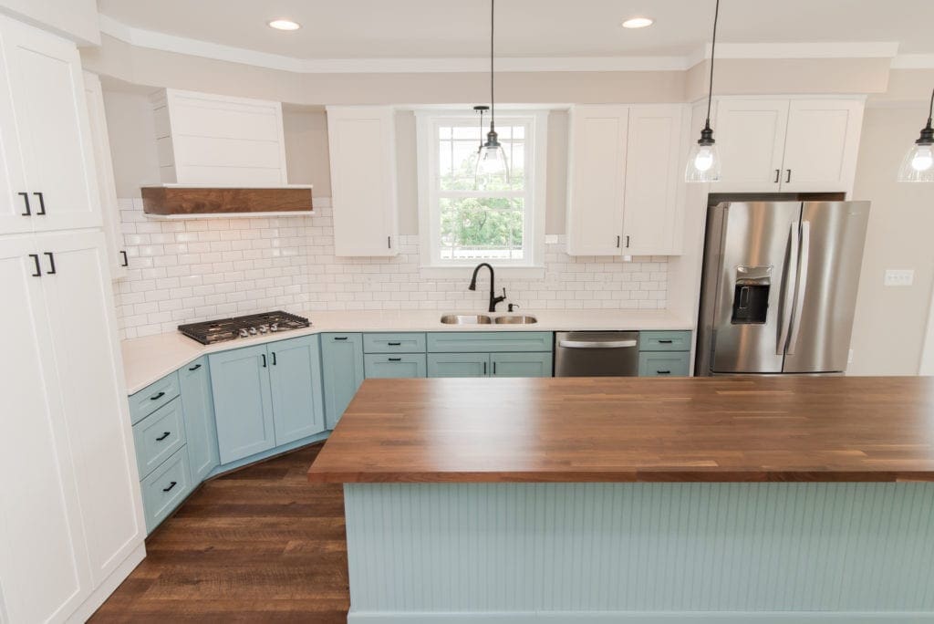
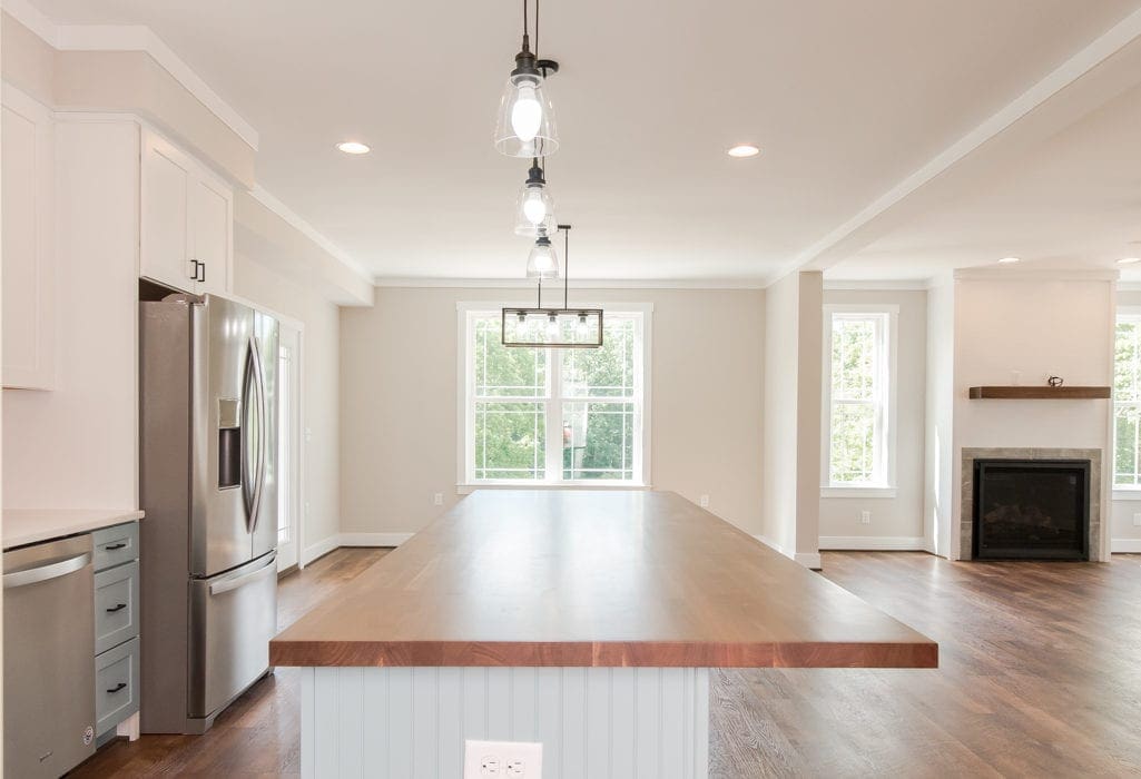
You’ll see in the image below how seriously we take the matter of illuminating our custom kitchens perfectly. From ceiling lights for ambient lighting to hanging pendant lights for task lighting, everything we add to our homes is state-of–the-art technology to provide you a luxury experience.

Coordinating elements in the kitchen:
When selecting countertops and flooring for your kitchen, coordinate and style the elements to create a beautiful and cohesive look. Use the right combination of textures and colors to create a more welcoming and stylish ambiance. You can even make a small kitchen look spacious just by using the right coordination of colors.
The tip we’d like to give you here is “keep things Neutral.” It’s the best formula to make your kitchen look spacious and not cramped. A neutral color palette with wood floors reflects light to illuminate the kitchen better.
At Bristol Springs, we follow good ergonomics throughout the kitchen planning. It helps optimize your space to be as comfortable to use as it looks beautiful. When thinking about the kitchen layout, planning is the key to creating a welcoming space, and we always invest enough time in it to make sure that we have designed it nothing less than perfect!


